
Jan
Analysis of a Logo #1 – The Dungeons and Dragons Ampersand
In 1974 a multiplayer tabletop game was created that had no pieces, no board, no visual elements at all. It was simply rules, in a book that allowed players sat around a table, to co-operatively tell a story of magic and adventure, transporting them to far off lands, allowing them to battle otherworldly beasts and create a captivating world and story, with their friends.
The game was called Dungeons and Dragons and it has since become a household name, even among those who have never played the game, perhaps knowing it as code for the most nerdy of nerdy things!
However, despite it sounding very niche, Dungeons & Dragons is actually a massive commercial success. The game is still being published today, and has been consistently since its origin, every now and then getting an update and alteration to the core rulebook. These updates are known as new ‘editions’ and 2014 saw the release of the 5th edition of D&D and with it came something else new as well.
I’ve only just started playing the game (despite having wanted to play for many years and being a hot blooded nerd since childhood!) and as such have been exposed to all the various books and materials required to create a character and enter the fantastical world.
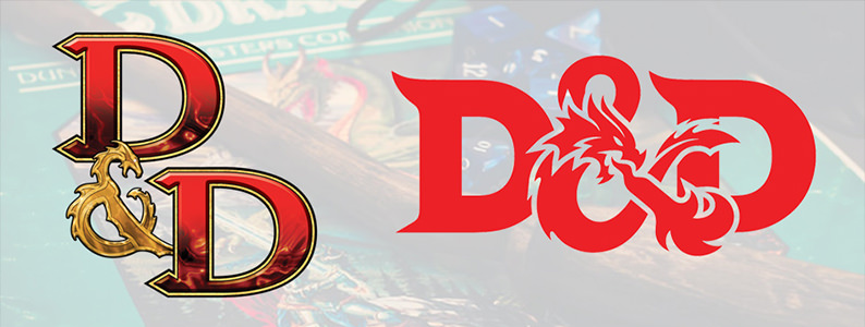
The release of 5th Edition saw the introduction of the new logo for D&D, a rebrand for the game and a whole new look, and upon looking at it with my designer hat on, I realised the interesting dilemma the creators of the new logo must have faced.

They needed to combine the ideas of high fantasy, typically a medieval or old-timey visual language, with that of modern brand design, whilst also remaining true to the long history of the brand. No mean feat.
However, 2-person illustrative design company, Glitschka Studios of the Pacific Northwest, were up to the task. They leant heavily on the Ampersand as the cornerstone of the brand identity, as indeed all previous iterations had, but conspired to simplify it into an immediate and recognisable, nay, iconic, brand mark.
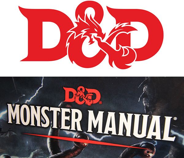
Previous editions had turned the ampersand of D&D into a dragon in the past, this was nothing new, but it wasn’t an icon. It was a picture, and sometimes wouldn’t even read as an ampersand, instead looking like a small painting of a dragon next to the words ‘Dungeons’ and ‘Dragons’. Glitschka clearly intended to make it readable as well as illustrative and this is where the success of the design comes in.
Rather than painting the scales of the dragon, or rendering the licking flames leaping from its jaws, or even casting the whole image in burnished bronze or shining silver, they kept it clean and block. The dragon is there, tucked into the brand mark, spewing flames, but your eye still reads it as an ampersand. Read as the ‘and’ in ‘Dungeons & Dragons’ and as such the ‘high fantasy’ feeling is imbued into you as you read it, without even noticing.
Glitschka then continued to pair their Ampersand with a blocky typeface with just enough serif presence to make it feel historical, without losing that bold, modern strength. The same approach as the brand mark itself.
![]()
Finally, the studio created a Brand Monogram, the nickname that has almost replaced the game’s actual name, ‘D&D’. The ampersand icon sits proudly between the two capital Ds, overlapping nicely and pulling the whole thing together as a logo in its own right.
It’s fantastic design work and it allowed Hasbro (the owners of Dungeons and Dragons) to market their new edition with just the ampersand. A powerful, understated mark that has reinvigorated a very old brand.
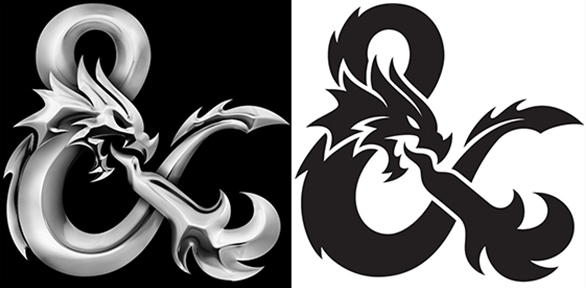
Sadly, Hasbro couldn’t leave it alone and after they inherited the artwork from Glitschka they made one final amend with their in-house design team, casting the logo in chrome steel. Maybe they felt it wasn’t ‘fantasy’ enough. Maybe they just wanted to put their two cents in the mix, to save Glitschka getting all the glory. Whatever the reason, Hasbro’s objectively weaker chrome version doesn’t appear very often, certainly not on the books, so that’s a relief.
The D&D ampersand stands as a testament to the old phrase ‘keep it simple’ but adds an understanding of the client, the brief and the subject matter. It’s respectful, historic and epic all at the same time.
Now I’d better go fetch my dice, my player’s handbook and my world map, because I’m playing D&D tonight. I hope our party doesn’t go up against a vicious fire-breathing ampersand…
Holla Creative are a team of young but experienced advertising and branding experts who have the industry knowledge and modern internet savvy to create a truly powerful creative identity for your business.
Get in contact if you would like to see how we can help!

Click here to view our work
No Comments