Aug
Brand Identity Deployment – your new logo is only half the battle!
An often-overlooked part of branding and business creative is the day-to-day continued deployment of the assets that form a company’s identity. Branding and creative identities are often formed from multiple different elements that have been crafted to work together in specific ways by the designer or agency who created them.
Many of these deployments will have been outlined in the inevitable brand guideline document that was presented along with the new brand. This is a document that outlines how the brand is to be used, when to use different versions, formats or arrangements of the artwork, what colours and typefaces to pair it with, where it should be positioned etc.
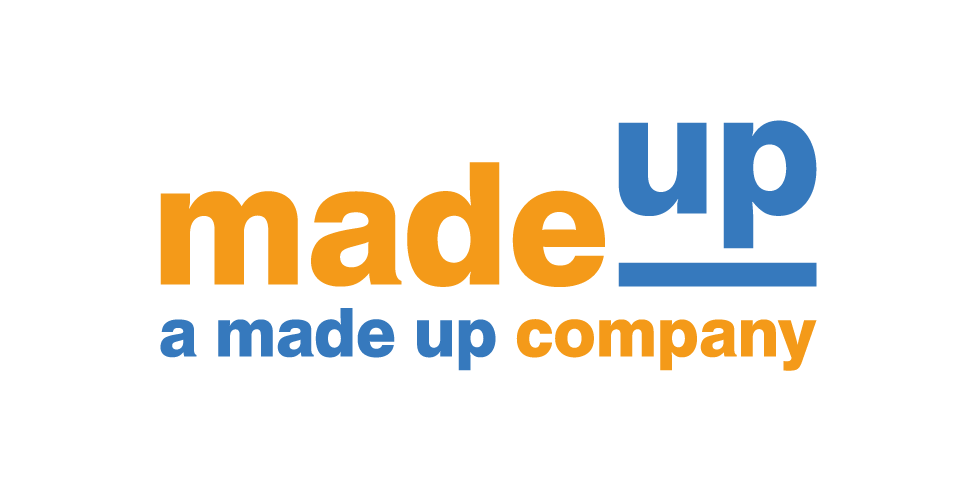
Here’s a new logo design for a hypothetical company. The brand is simple and clean with a neat little visual device and a strong pair of brand colours
It might all sound a bit much at first but a great logo can be ruined by a bad deployment and if you’ve spent all the money with a designer/agency to create the brand, and have trusted their knowledge on this part of the design, then why not trust them on the deployment rules too?
After all, they should know how to deploy it… they built it!
The trouble comes a few months or years down the line. The new brand has become the norm, taken for granted as the company’s identity. You and your employees can’t even remember what the old brand looked like!
Businesses regularly put out pieces of printed or digital communication, on a near daily basis, to their own internal staff or out to their customers. This means, little pieces of creative, usually with the company branding on them are being made and deployed all the time, by all tiers of employees in the company.
Maybe you want to put a quick emailer together to alert a subset of customers about a change in opening times, or you want to make a poster for a coffee morning to put in your store windows. These are small jobs and you can do them in-house, you certainly don’t want to have to pay for an agency to do them.
But this is where the errors creep in. Maybe one of your employees is doing a valentine’s day sale at their store, and they think they’re being creative by changing the colour of your brand to pink for the posters! Maybe it’s Halloween and one of your store owners has changed your strapline typeface to a blood-dripping font to make it a bit spooky! Maybe they even changed the wording of your strapline to add the word ‘ghoul’ or ‘pumpkin’ in there too!
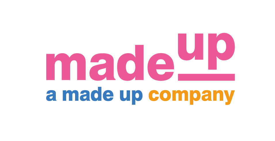
On Valentine’s day, someone at ‘MadeUp’ decides to put the brand in pink. Problem is, the tagline is still in the brand colours and now they clash, horribly!
To you, these may seem like harmless, temporary alterations, but to designers, particularly the ones that designed your brand, they are grand crimes!
So why is that? Is it really that bad, or are these creative hipsters just overreacting to justify the importance of their craft?
The answer boils down to aspirations. It concerns the future of your business, and the way you want to be perceived. Turning your logo pink will probably not lose you money or customers. Writing your tagline in a blood-soaked typeface will not empty your bank account.
But it will leave a lingering thought in the back of your customer’s heads. An imperceptible, sub-conscious flavour, that affects the ongoing perception of your company in their eyes and minds.
They’re a bit cheaper.
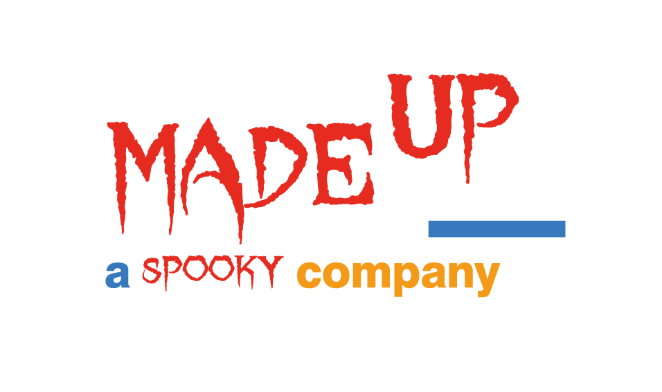
Now it doesn’t even look like the same company anymore. The font doesn’t only suggest ‘halloween’ it also changes the whole feel of the company. Not to mention the bad design with the left-over blue line and the now too-short tagline.
To qualify this, I ask you to recall the last time you saw the Apple logo with googly eyes and vampire fangs added on for Halloween. Or when you last saw the Coca Cola logo written in a different font and coloured yellow? Have you ever seen the BMW badge turned into a cartooney wheel on a car, or the BBC boxes altered in shape to look like city buildings?
You never have.
And you can argue that they are no fun and don’t have a sense of humour all you like, but they don’t care, when their turnover is over a thousand times larger than the local carpet warehouse that put a Santa-hat on its brand for Christmas.
The truth is, these brands DO have a sense of humour and fun, and will create custom creative to celebrate holidays and other events. But when they do, they create campaigns to carry the personality and design of the event, and leave the brand untouched and consistent. Whenever the brand appears, it looks the same. It’s a very easy and straightforward thing to do. Do whatever you want with your creative, ideas, campaigns… just leave the brand as it is.
Consistency builds trust. Customers subconsciously know exactly where they stand when a brand has remained professional and consistent throughout the years. If Coca-Cola turned its logo yellow, people would wonder if it was Coke, or something else. If Apple betrayed years of minimalist design to put googly eyes on their logo, people would immediately question if it was actually Apple at all! It might be a scam!
These are extreme examples of course, but the reaction in the customer’s eyes and mind is the same, just on a smaller scale over a longer period of time. Your small business may not be the size of Apple, or Coca-Cola, or BMW, but if you have ANY aspirations of eventually being like that, then act like a big, professional brand from the start.
Consistency builds trust. Trust leads to growth. Be professional and stylish in all your creative and communication and you’ll notice the difference. It might take years, but I can guarantee it will take much longer if your logo is hatching out of an egg every Easter!
Holla prides itself as being your brand guardian. When we create a new brand for a company we always provide a comprehensive Brand Guidelines document to help with future deployment and offer our services to be the creative eyes to ensure it is always kept consistent.
We are passionate about our designs and believe in the creative process used to design them. As such we believe in fighting for them to look their best and help their respective companies as much as possible.
Get in contact with your brand requirements today as Holla won’t just complete the brand and then walk away. We’re with you every step of the way to making all your creative work the very hardest it can for you and your business.


No Comments