Feb
Top 5 mistakes businesses are making in their creative
The creative industry is a fast moving one and it is often very easy to make mistakes. When deadlines are looming and the content has to be signed off by a whole board or committee of directors, the message can get lost behind some major slip ups. Here are the top 5 mistakes, we see some of the biggest businesses making with their creative.
1. Lack of brand unification
Keeping the deployment of your brand 100% consistent across all your communications is one of the most important things to keep in mind when putting out creative. What’s the point of putting all that work into your awesome new logo and style if half the time it is obscured or occluded by bad or inconsistent design?
Sometimes it can be really tough to stick steadfastly to your brand rules but if you don’t, the customer’s journey can become broken and before you know it you have lost engagement and they are spending money with a competitor.
Little things like deciding on logo positioning, restricting colour ways, always having calls to action in the same place and consistently using the brand typefaces are just 4 of the most basic ways you can keep consistent with your brand.
A good creative agency is one that can solve these problems for you, keeping a brand deployment consistent across ALL platforms.
Check out our portfolio for plenty of examples.
2. Calls to action
It’s amazing how often a huge company will forget to place a call to action on their latest piece of creative. The belief that it might clutter the message is a false one. ALWAYS leave the customer a way to get in contact; whether it’s a few social media icons and handles, or a full address, a CTA is vital.
3. Information overload
As a creative agency, we are all too often briefed on a piece of creative with an overload of messaging, 90% of which is unnecessary. But because the client has spent weeks working out all the deals and offers they can now provide, they want to showcase them all on your new postage stamp-sized ad in the paper!
The obvious truth is, if you have 13 different offers on one ad then you’re not spotlighting anything. Focus and clarity are the most important thing. Take the offer or promotion that has the best hook or is the most easily explained to the customer and lead with that. Let them discover the rest of your awesome offers, once they have navigated to your site.
4. Webfonts
When you create that fantastic looking email on your computer and send it out, you may not even realise that when it arrives in your customer’s inbox it looks completely different.
The problem is if you have that fancy font on your machine then it will always load and look great for you. But in all likelihood, the customer won’t have that font. They’ll probably be running a PC from the 1920s with Windows 1 and only 3 typefaces installed! When your email comes through, their computer can’t find that cutting-edge font you used and so it loads in Times New Roman or even worse… COMIC SANS!
Suddenly your cool brand identity is trashed and in the worst place possible, on a customer’s computer! Avoiding this is easy. There are a number of ‘webfonts’ which are available to any machine no matter how old or weird because they’re stored on the internet.
Find a webfont that matches your company’s identity and make sure you use that in all e-comms. Then you can sleep soundly knowing your identity is safe.
5. Checking with an expert eye
Sometimes we miss things. It’s only human. But in creative studios, we have that training to see things in a slightly different way. To come at creative from that weird angle, and as such we often spot something that businesses might have missed… but their customers wouldn’t.
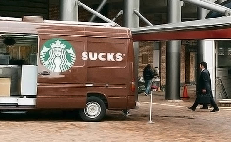
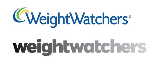
We’ll leave you with a couple of examples where some creative could have benefitted from a second pair of eyes!

That reflection makes the word ‘suit’ look like something rather less appropriate

The new Weightwatchers logo draws the eye to a rather unfortunate 4 letter word right in the middle
For a creative agency that thinks of everything, please feel free to check out our portfolio or contact us today.
If you would like to receive more informative articles like this one, please sign up to the Holla Club Newsletter.


No Comments