
Feb
Is your company website responsive?
3 ways a lack of website responsiveness could massively impact your business.
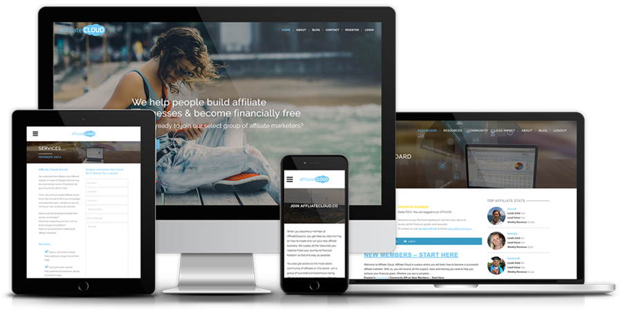
A responsive website is one that adapts its layout of information and imagery, to the size of the screen it is being viewed on. As we all know, the navigation of your site is the most important thing, but what many businesses don’t realise is that you can’t just shrink your desktop site down to the size of a phone screen. The links and buttons would be tiny and that brilliant full-page image you had as your home page, now looks like a postage stamp.
A responsive site changes massively, in some cases into a completely different looking site, when viewed on smaller screens to maintain that navigable user experience. Here are three reasons why this is SO important.
1. We now browse the internet on our sofas
According to Ofcom, two thirds of people in the UK now own a smartphone and they browse the internet on it, considerably more than they do on a desktop computer. Sat in front of the TV in an evening they will have their tablet or phone in their hand, and any shopping, browsing, facebooking they will do on this small handheld.
If you’re a retailer, or a company that advertises through social media, the last thing you want is a casual browser to click your link only to find they cannot navigate your site easily. Comfort and ease is king, on the sofa.

Credit: We Are Social / Hootsuite
2. Those pesky Google search results
Google now uses ease of navigation and mobile friendliness as a way to curate search results. So the more responsive your website is, the higher up the search results it will appear when people search for you.
Enough said on that one!
3. Optimal viewing experience
Its all well and good having a tablet site, and a mobile site, but what if someone views your site on a smart TV? Or a Nintendo DS? Or a Kindle Fire? The last thing you want is excessive scrolling and resizing. With the huge variety of internet-enabled devices out there you never know what your customers might be viewing your website on, and this could impact your sales and engagement.
How to find out if your site is responsive
The easiest thing you can do to find out if your site is responsive is to resize the window of your browser and watch what happens to your content. If your text shifts to make sure it all stays on screen, and your images shrink and rearrange to always be seen, then CONGRATULATIONS! Your site is responsive!
If however, as you pull that window border in, it just hides your content as though you’re just pulling a rug over your precious website then I’m sorry to say your website is NOT responsive.
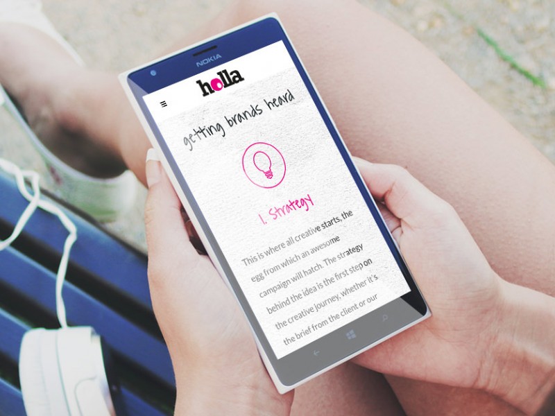
Here at Holla Creative we specialize in cutting-edge web design and every site we build, doesn’t leave the door unless it is 100% responsive. This means your site is clear and well represented on ANY device and ensures your company is always represented in the very best possible light.
A non-responsive site is a perfect opportunity to get us to refresh your web-presence as a whole, to get your business a new site for a new year and never lose a mobile device user again.
Did you know?
40% of mobile searches have local intent
(Google Mobile Moments Study)
Google says 61% of users are unlikely to return to a mobile site they had trouble accessing and 40% visit a competitor’s site instead
(MicKinsey & Company)
88% of consumers who search for a type of local business on a mobile device call or go to that business within 24 hours
(Nectafy)
Tablet devices account for the highest add-to-cart rates on e-commerce websites at 8.58%
(Smart Insights)
Click here to drop us a line if you want to discuss a project!
If you would like to receive more informative articles like this one, please sign up to the Holla Club Newsletter.
nanoo
Wonderful article! We will be linking to this great article on our site.
Keep up the great writing.